Using a brush, knife
and scratching:
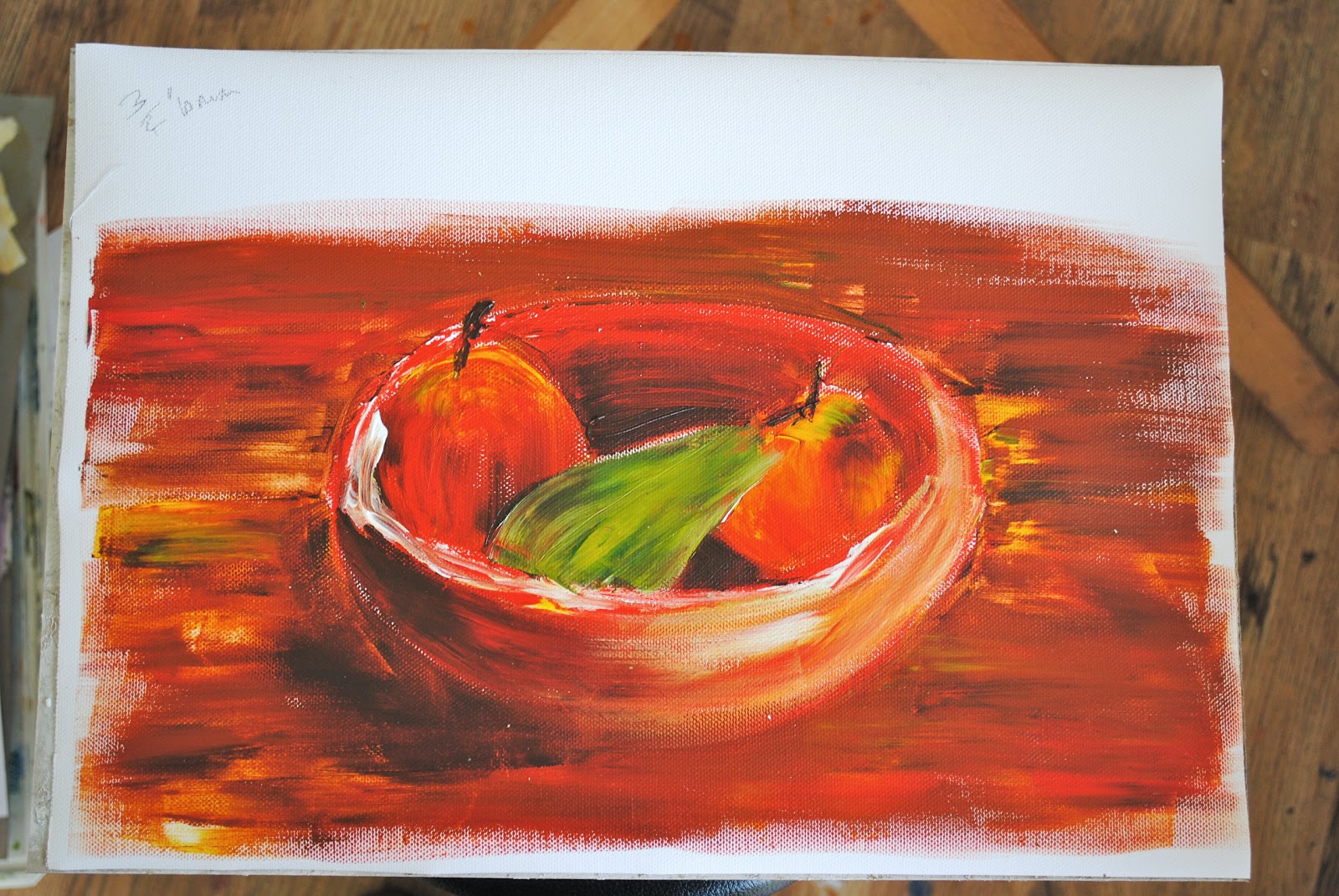
For the brush exercise, we are asked to load the brush
heavily without mixing colours. Using a
fairly large brush (3/4”) I laid out red, yellow, green, brown and white heavy
body acrylics. Using the large brush
makes it impossible to be delicate, or even necessarily accurate with detail,
so the main aim of this style of painting is colour and brushstrokes. While I could probably have used a
smaller brush for the fruit, this size
of brush worked well for the table and the bowl. The streaks of colour add a depth and
interest to what would otherwise be a relatively flat paint tone and allows you
to add quite bright (and imagined) colours, such as the green in the table,
which also reflects the colours of the fruit, without looking too garish. The amount of paint on the brush makes for a
slow drying time, which also encourages you to mix the colours on the canvas . Some of the wet paint also gets removed by
subsequent brushstrokes (such as by the edge of the bowl) giving a variation of
depth of paint, allows the white of the canvas to show through and gives an
interesting stained effect.
The knife painting was not so successful – I started too
small which made it difficult to get any depth of colour in the painting
without muddying the colours too much. I
found it very difficult to control the knife (the smallest I had), especially
when creating curves and circles. I also
found myself scraping off the underlying layers when trying to apply a new
colour (probably should have waited for it to dry!). However, as with the previous exercise, this
did allow for interesting textures and colour variations created by the
differing thickness of the paint.

I have a couple of acrylic impasto mediums: gloss gel and
impasto gel which I used with various implements and applied neat to paper,
using palette knives pressed in, lifted off, dragged through and swirled to
create a number of patterns. Different
colours and consistencies of paint were applied over the top to enhance the
effects of the texture.

A further sheet was created using implements pressed into
thick medium applied directly to the paper: cling film, corrugated card, a
paintbrush handle, paper towel, an old brush dragged through and tin foil
impressed.

Reviewing these sheets, the ones I feel are most
striking in terms of pattern are; the large palette knife impressed (dry
brushed over this which gave a “snakeskin” effect), the lines carved into the
medium with a knife, and the foil impressed into the medium. Foil gave a more defined, larger texture than
cling film. To enhance this I applied
various layers of paint: purple wash, white paint rubbed off, blue paint rubbed
in and then sanded back to the previous colour layer. I felt this texture would be very effective
in small areas to depict peeling plaster or paintwork.
Exercise: Dripping, dribbling and spattering
My own version of dripping, dribbling and spattering took
place on my lawn in the sunshine, with lots of newspapers spread around to
contain the mess. Three canvases were
created, one on an unprimed canvas, the others on coloured grounds to explore
the colour effects.
Dripped, dribbled, poured and tipped. I have an old square canvas that had an orange and yellow
loosely applied acrylic ground so my immediate thought on this was
complementary greens and blues. Rather
than waste expensive heavy-body acrylic, I used a cheap set of opalescent
acrylic paints, along with a small amount of dilute Daler Rowney acrylics. I found it initially quite tricky to get a
consistency that would pour evenly in fairly small lines (using plastic cups
and a small jug to pour) so decided not to bother with this canvas so just went
with a heavy application of poured paint with the orange ground showing through
in some areas. I also used a bbq skewer
to drag out some of the paint into lines and give a more spiky feel to the
canvas. Whilst still wet, I also
dribbled some PVA glue into the blue/green poured paint.

After this had dried (about 3 days!) I looked more closely
at the texture on the painting. The
paint used (opalescent acrylics) had separated slightly and left a bobbled,
raised texture where the different poured colours were different
consistencies. The PVA left an
interesting, rope-like effect; where the glue was heavier than the paint, it
had sank through the poured colour, showing the ground colour through the clear
paint.


Dribbled and angled. For this canvas, I used a narrow range of analogous
colours: green, pale blue, darker blue and blue violet (plus white) swirled
onto the canvas until the whole central area was wet with paint. I gently tipped it in various directions to allow
the colour to run and the lines of colour to form interesting patterns. This one I find interesting with the layers
of colour - the pale green underlayer showing through, swirls of colours on the
edges of the canvas and then a "melted" effect of contour lines in
the centre. The swirls of paint here are
almost hypnotic – you begin finding a line and then follow it round, noticing
how it mixes and merges with other patterns and the imagined images created
within.

Paint Consistency and Alcohol. Again, using opalescent paints but this time on a black
ground. The paint was applied in varying
consistencies: straight from the tube, diluted with a little water and then
very dilute/watery (again using containers with holes punched in the bottom). Once all the paint was dribbled on, I sprayed
some areas with alcohol from an atomiser (which quickly spreads the paint and
then evaporates, leaving a very thin, transparent layer) and angled the canvas
to move the paint around. The interest
here is in the different thickness of the paint
- it was interesting to work with the very thick, impasto paint which
merged with the thinner paint to leave
loose blobs of colour. This would be a
difficult technique to create an image due to the unpredictable nature of the
paint but would certainly provide a very interesting underpainting for a highly
textured or mixed-media work.


No comments:
Post a Comment