Monday 26 August 2013

Project: Adding other materials


Exercise: Preparing a textured ground

Various materials stuck on (with either PVA or gesso) to cardboard (mainly backs of paper pads) to create texture: sand, rock salt, dog hair, bird seed, dried-out individual cleaning wipes; sheets of kitchen wipe, paper (smooth cartridge and watercolour), gesso scratched into the surface while wet, pva dribbled from the bottle and skeletonised leaves.  All then prepared with a thin coat of gesso to enable painting.  Different paint 
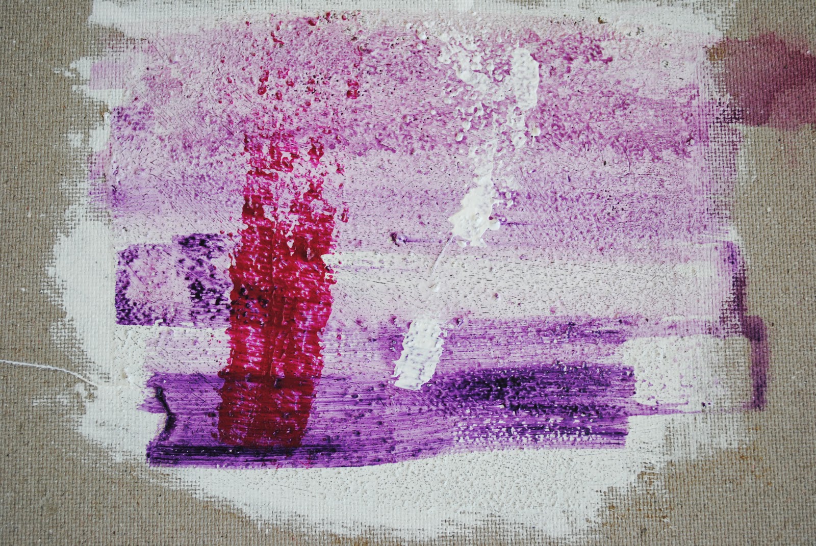
consistencies applied (dilute through to neat/dry brush) to see effect of colour on the surface texture.  Some of the heavier textured samples (eg bird seed and rock salt) were difficult to paint over but I feel this just adds to the sense of texture with the deep shadow areas creating their own tones.  One problem I did note on applying texture to canvas was the weight of the application made the canvas curl – I think you really do need to use either a heavy card or board for this type of painting.


Created grounds (with title in mind):
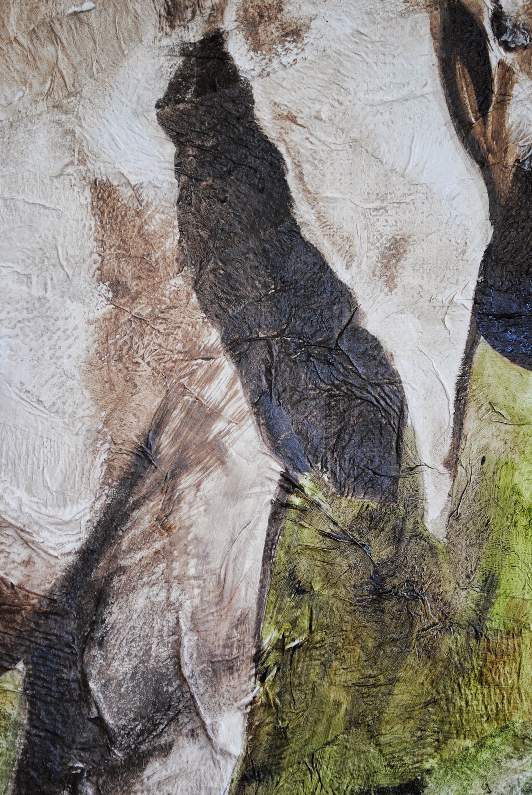

Wrinkled

The textures I had created with both the kitchen paper and the cleaning wipes instantly reminded me of tough animal hides (have been on safari twice so thought of rhino and elephant).  My initial experiments had been sticking on the materials with PVA but this took forever to dry so instead tore up patches/strips of the wipes/kitchen roll and applied very loosely with gesso, painting over the top quickly to seal in.  The effect of the liquid made the paper wrinkle on application which I developed further by pushing into it with an old brush.  Being just paper and gesso, although fiddly to apply (and very messy and awkward around the edges) the prepared ground dried overnight.


I found a photograph of an elephant taken in Kenya and, as this is a complicated form, decided to do a detailed drawing to better understand the folds, wrinkles and textures of the skin (A2 - charcoal and H pencil).


As the prepared support was very textured, I decided to blow up my drawing on a photocopier and to use the outline as a stencil, as I did not want to make the surface dirty and knew it would be virtually impossible to erase. 

In terms of colour, elephants aren’t really grey anyway, and as they always cover themselves in dust, it is more a neutral beige with hints of grey.  Looking at the colour more closely, it reminded me of one of the colours used in my assignment 2 (still life) piece (the jug).  I referred back to my colour chart for this painting and so created my base colours plus darker shades from this.

In order to allow the ground to continue to be an important part of the painting, I applied the paint in very transparent layers, diluted with turps (which also allowed the layers to dry very quickly) using a large brush to allow the colour to sink in (or conversely skip over in places) the folds and wrinkles created by the cloth and paper.


Spray

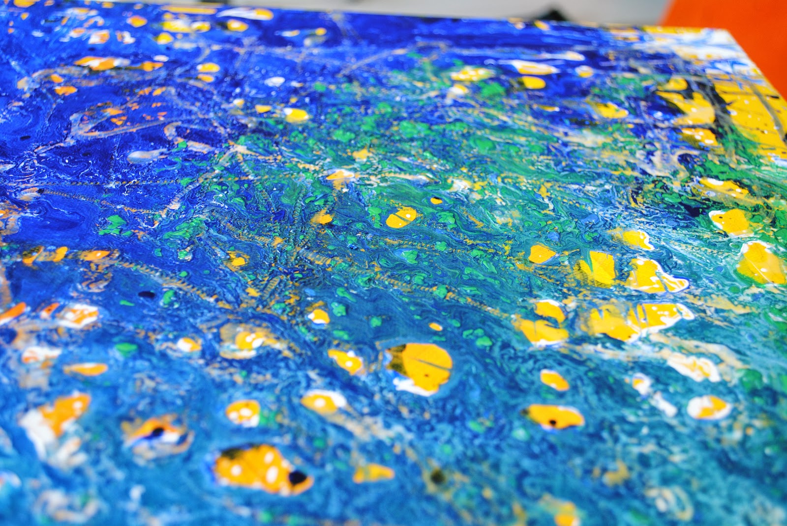
The second textured ground was created as a reaction to my original small experiments on board - I had applied adjacent patches of rock salt and sand on a small board which brought to mind beaches / seashore / crashing waves.

I found a photograph on the web, and created my interpretation of it using charcoal pencil, cropping the image to concentrate just on the area of the beach, foam and the unusual mottled texture you see in between waves.


After basically sectioning out the cardboard, the main crashing waves were created with sea salt, applied thickly with PVA, concentrating the salt on the crest of the waves.  The texture medium and salt was pushed into shape with an old brush, which also added a textured layer for the front side of the wave.  Sand was applied for the beach and texture medium applied with a brush for the foremost, small cresting wave.  The area I struggled with slightly was the texture for the central section between the waves.  After various experiments with foil, cling film, etc, I tried slightly scrunching up some wide masking tape, then unfolding it slightly and sticking layers of this together.  This worked very well in lifting up stiff peaks in the impasto medium.  


After leaving to dry (for about a week!) I coated with gesso and then over painted in oils.


Different Ways of applying paint

Exercise - Impasto (all done in acrylic)


Using a brush, knife and scratching:

For the brush exercise, we are asked to load the brush heavily without mixing colours.  Using a fairly large brush (3/4”) I laid out red, yellow, green, brown and white heavy body acrylics.  Using the large brush makes it impossible to be delicate, or even necessarily accurate with detail, so the main aim of this style of painting is colour and brushstrokes.  While I could probably have used a smaller  brush for the fruit, this size of brush worked well for the table and the bowl.  The streaks of colour add a depth and interest to what would otherwise be a relatively flat paint tone and allows you to add quite bright (and imagined) colours, such as the green in the table, which also reflects the colours of the fruit, without looking too garish.   The amount of paint on the brush makes for a slow drying time, which also encourages you to mix the colours on the canvas .  Some of the wet paint also gets removed by subsequent brushstrokes (such as by the edge of the bowl) giving a variation of depth of paint, allows the white of the canvas to show through and gives an interesting stained effect.


The knife painting was not so successful – I started too small which made it difficult to get any depth of colour in the painting without muddying the colours too much.  I found it very difficult to control the knife (the smallest I had), especially when creating curves and circles.  I also found myself scraping off the underlying layers when trying to apply a new colour (probably should have waited for it to dry!).  However, as with the previous exercise, this did allow for interesting textures and colour variations created by the differing thickness of the paint.


I have a couple of acrylic impasto mediums: gloss gel and impasto gel which I used with various implements and applied neat to paper, using palette knives pressed in, lifted off, dragged through and swirled to create a number of patterns.  Different colours and consistencies of paint were applied over the top to enhance the effects of the texture.


A further sheet was created using implements pressed into thick medium applied directly to the paper: cling film, corrugated card, a paintbrush handle, paper towel, an old brush dragged through and tin foil impressed. 


Reviewing these sheets, the ones I feel are most striking in terms of pattern are; the large palette knife impressed (dry brushed over this which gave a “snakeskin” effect), the lines carved into the medium with a knife, and the foil impressed into the medium.  Foil gave a more defined, larger texture than cling film.  To enhance this I applied various layers of paint: purple wash, white paint rubbed off, blue paint rubbed in and then sanded back to the previous colour layer.  I felt this texture would be very effective in small areas to depict peeling plaster or paintwork.

Exercise: Dripping, dribbling and spattering

My own version of dripping, dribbling and spattering took place on my lawn in the sunshine, with lots of newspapers spread around to contain the mess.  Three canvases were created, one on an unprimed canvas, the others on coloured grounds to explore the colour effects.

Dripped, dribbled, poured and tipped.  I have an old square canvas that had an orange and yellow loosely applied acrylic ground so my immediate thought on this was complementary greens and blues.  Rather than waste expensive heavy-body acrylic, I used a cheap set of opalescent acrylic paints, along with a small amount of dilute Daler Rowney acrylics.  I found it initially quite tricky to get a consistency that would pour evenly in fairly small lines (using plastic cups and a small jug to pour) so decided not to bother with this canvas so just went with a heavy application of poured paint with the orange ground showing through in some areas.  I also used a bbq skewer to drag out some of the paint into lines and give a more spiky feel to the canvas.  Whilst still wet, I also dribbled some PVA glue into the blue/green poured paint. 


After this had dried (about 3 days!) I looked more closely at the texture on the painting.  The paint used (opalescent acrylics) had separated slightly and left a bobbled, raised texture where the different poured colours were different consistencies.  The PVA left an interesting, rope-like effect; where the glue was heavier than the paint, it had sank through the poured colour, showing the ground colour through the clear paint.


Dribbled and angled.  For this canvas, I used a narrow range of analogous colours: green, pale blue, darker blue and blue violet (plus white) swirled onto the canvas until the whole central area was wet with paint.  I gently tipped it in various directions to allow the colour to run and the lines of colour to form interesting patterns.  This one I find interesting with the layers of colour - the pale green underlayer showing through, swirls of colours on the edges of the canvas and then a "melted" effect of contour lines in the centre.  The swirls of paint here are almost hypnotic – you begin finding a line and then follow it round, noticing how it mixes and merges with other patterns and the imagined images created within.


Paint Consistency and Alcohol.  Again, using opalescent paints but this time on a black ground.  The paint was applied in varying consistencies: straight from the tube, diluted with a little water and then very dilute/watery (again using containers with holes punched in the bottom).  Once all the paint was dribbled on, I sprayed some areas with alcohol from an atomiser (which quickly spreads the paint and then evaporates, leaving a very thin, transparent layer) and angled the canvas to move the paint around.  The interest here is in the different thickness of the paint  - it was interesting to work with the very thick, impasto paint which merged with the thinner paint  to leave loose blobs of colour.  This would be a difficult technique to create an image due to the unpredictable nature of the paint but would certainly provide a very interesting underpainting for a highly textured or mixed-media work.


Research Point


The artists we are asked to research have very distinctive styles of applying paint.
Clause Monet’s paint application became much looser throughout this career.  He is most famous for his impressionist works and his later works of his garden at Giverney.  His most famous impressionist works are created by applying short “flicky” strokes of paint, either wet in wet or by scumbling (applying wet dabs over dry paint).  This works by optically mixing the paint on the canvas and so give his works a soft feel as there are very few hard lines or edges.  When applying paint by the scumbling method, this also adds texture to the canvas as well as breaking up the further dabs of paint which are applied over the previous layers.  As Monet aged and his eyesight began to fail, he concentrated on painting the familiar scenes of his Japanese garden and waterlillies in his garden at Giverney.  These later paintings have the paint applied much more loosely, using much larger strokes and wording on a larger, overall scale.  See below two impressionistic paintings and one of his later paintings which demonstrate his techniques.

Van Gogh’s paint is very thick and textural, to the point of creating a three dimensional image which creates its own shadows and highlights, irrespective of the colour of paint applied.  One thing which stands out about Van Gogh is the way that he paints as he draws with ink – very thick, staccato strokes, heavy outlines, hatching (both with colour and highlights).  He also uses these very deliberate strokes to emphasise other shapes and to lead us to the focal point of the painting.  Paintings which typify this approach are:
Self-portraitwith felt hat – directional strokes around the head creating a framing, halo effect.
CrownImperial Fritillaries in a Copper Vase (use of hatching strokes to denote form and highlights)
Paul Cezanne, a contemporary of Van Gogh, has a very different, but equally distinctive style, again emphasising the surface texture of the paint using visible brushstrokes.  (The Chateau de Medan) Cezanne applied regular and even sized brushstrokes across the canvas, in parallel oblong blocks of colour.  Cezanne did not use one of the devices of perspective, that of altering the size of this brushwork to create depth, so instead he relied more heavily on aerial perspective and colour change.  In his later years, he simplified his style even further, leaving more areas of bare canvas, and applying the colour in larger blocks, with more vertical strokes, in a more abstract style (Route Tournante)