For the soft
landscape, I decided to work from a photograph taken of a wide woodland track
in Langdon Hills Country Park as this path is quite isolated (and at the time
very cold!).
Rather than
sketch out the scene (bearing in mind the upcoming “painting outdoors”
exercise), I wanted to work more freely and to try to translate a very
complicated view without being too tight and fiddly.
The
photograph was taken just as spring began, and so there was the contrast
between some of the trees and shrubs showing their first leaves and some others
still bare, skeleton branches. The path
slopes gently uphill, providing a sense of perspective and distance, while the
bareness of the trees providing strong tonal contrasts of sunlight through the
branches against deep, dark shadow areas.
Working on a
pale blue ground, I began (in acrylic) blocking in the track and the largest of
the trees, following by working on larger tonal areas and then final details
(photo sequence below).


My thoughts
on this painting:
- The sky is far too blue and solid and the branches and too fussy without actually looking like branches!
- The effect of the sunlight through the trees is too “stripy” and the trees do not have form, they are too flat
- Colour is not bright enough for spring (too much white in paint to create the greens)
Second
painting below:

This is
better than the first, but I’m still not happy with it. Review:
- Using a darker blue toned background, but then painting the lighter sky colour negatively around the branches (and just leaving some of the background) is much more effective at depicting fine branches than positively painting the branches.
- Adding dabs of the sky colour amongst the trees (especially around the “tunnel” at the end of the path) works to show gaps in the trees without being too detailed.
- The trees are not as stripy and have more form.
- The tonal contrast between the left and right is stronger to show the light source coming through the trees on the right.
- Not happy with the colour again – the greens are too olive and not fresh enough for spring – almost autumnal colours.
I felt
working on a larger scale would also free up my brushstrokes so bought some
larger brushes (1.5”, 1” etc), flat Daler Rowney brushes and large canvas
panels (24 x 32”)
Finished
painting:

For the
ground, I created a bright blue which is visible throughout the whole painting.
For the sky / branches I expanded on the
technique in the previous painting using short, multi-coloured brushstrokes
alongside fine branches created by using the edge of a large brush. I feel this works much better because the
broken brushwork, combined with the multi-coloured brushstrokes, breaks up the
sky – working negatively also results in finer branches. I think using the large flat brush on its
edge (the Daler Rowney brush has a very fine edge) has created more natural
branches as the colour is not applied solidly along the edge of the brushmark.
The main
shrub areas were similarly created using directional brush strokes and mixed
colour. Smaller dabs of colour were
added using the edge of a large brush or the corner of the smaller 1/2” brush.
I think the
top half of the painting works better than the lower half: I probably needed
more colour variation/visible brushwork in the dark tones, although I think the
strong contrasts work. Additionally,
some of the brushwork could have been bolder – I think you need to consider the colours used in advance to avoid too many
layers making the colour becoming muddy and keep the spontaneity.
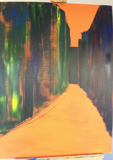
Hard Landscape
After
completing this painting, I decided to also attempt a hard landscape using a
similar technique. I have always shied
away from painting complicated street scenes; mainly a case of where to start
without drawing every line, resulting in an unadventurous painting.
Again this
was from a photograph (Bow Lane in the City of London) so, in an attempt to
impose my own style on the painting, I printed it out in greyscale to avoid
being distracted by actual colour.
I carefully
considered the ground colour which I intended would still be visible in areas of
the painting to add cohesion. As the
image was of a bright, sunny morning I decided a warm orange would be a good
start as this would work well with both yellow tones as well as complementing
the blue tones I planned to use for the darker tones and shadows. The ground was therefore a vibrant orange comprising
magenta, yellow and a little white to lighten slightly.
I loosely
blocked in the main shapes of the buildings (only drawing a line to indicate
the bottom of the row of buildings on the left to get the perspective
correct). The colours used here were
yellow, sap green and cerulean for the left side and cerulean, sap green,
purple and brown for the buildings in shadow (kept two of the same colours for
consistency). I used the 1.5” brush for
this applying the colour with large, sweeping strokes.

My next step
was to block in the figures walking up the street to ensure the perspective and
scale was accurate, followed by adding the traditional hanging shop signs,
again to make sure the perspective was correct and to give me the correct
placement of shop fronts / windows, etc.


At this
point I also added the sky as a light tone (white, a little magenta and
cerulean) along with the main lines of the shop fronts (again using multiple
colours on the brush).


I continued
working up the main lines of the painting – focussing on only the main lines of
the buildings while ensuring strong contrasts between the tonal areas.

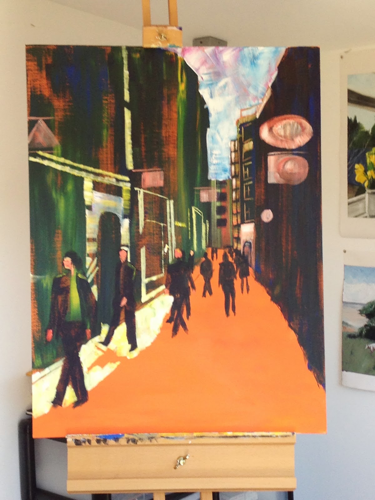


Review:
I am very
pleased with this painting. It is full
of colour and tonal contrasts without being remotely fiddly!
Working
larger has definitely helped, as has changing my acrylic paint (to a much
thicker brand which is more like the consistency of oils) along with the larger
brushes – it makes it physically impossible to be too detailed or fiddly.
The painting
is representational and perspectively accurate while keeping a much looser
style than I have previously been able to achieve. However, the paint application is clearly an
important part of the painting, all brushstrokes are clearly visible, with
areas of thick paint as well as thinner dragged colour.
The ground
colour works to bring the whole painting together as it is visible in small
areas throughout. Think it is especially
effective on the buildings on the left where I have loosely dragged the darker
colours over the top – this gives the effect of solid brick without being too
obvious.
The
perspective is fairly accurate – there is the odd line that is slightly out of
alignment but I wasn’t going to paint over areas as this would have lost the
spontaneity and I don’t think it really matters in the overall scheme of the
painting.
Colourwise –
the same colours are used throughout the painting (e.g. green and blue used for
both shadow and highlighted buildings), just in different proportions. Also the yellow/white/green combination has
been used for both the painted shopfronts / windows / paving in sunlight – it
is only the underneath colour showing through which affects the final colour.
I debated
whether to add the strings of lights zig-zagging down the street but I think it
does pull the image together as it leads the eye through the painting via the
hanging signs, as well as the strong contrasts (dark against light sky and
light against dark buildings).
The only thing I
probably would change is the figures – need to give these more thought before
applying paint to canvas. The smaller
figures walking down the street are ok – because I painted the blue shadow
around them, it has left small areas of orange ground which define them. However, I think I should have made the third
largest figure more defined, although I did want to treat the figures with the
same