Sunday 12 February 2012

Assignment one continued

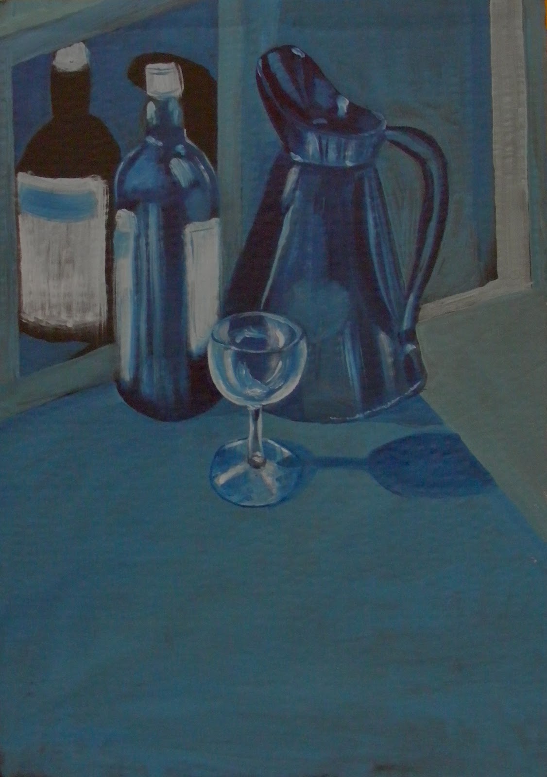
Using acrylics, I did quick colour sketches (in acrylic) on top of both the above grounds. 


Although the yellow did provide a very warm ground, I felt it was too bright for this subject, and would have to be toned down considerably to be used successfully – the bright yellow just dominated too much.

The second colour sketch on the raw umber/purple ground I felt was more successful in terms of providing a warm, indoor background colour to my painting although, again, the colour was a little strong.

I decided to work along the lines of the redder tones but to lighten it for my final painting.   I began mixing oils and testing them on a sheet of paper, and eventually decided upon a ground of crimson alizarin, raw sienna and cobalt violet which was heavily diluted with thinners and then applied to an A2 sheet of canvas paper with a rag to blend the colour in. 

I then drew the basic lines of the composition in light charcoal to avoid it showing through to the final painting.

In order to allow the background to show through to the final painting I used mainly transparent paint, using turps to thin.  This also had the benefit of drying quickly!

I used a light ochre wash to mark out the basic shapes and angles of the cupboards and then worked up from there, trying not to be too hung up on all the detail in the painting.  For the myriad books, I used muted colours and, in most cases, a single stroke with a flat brush.  I then used a cut up credit card as an implement to give the impression the writing on the spines.  The other objects on the shelves (ornaments, etc) I tried to complete with the minimum of brush strokes.  For the shadows, I mainly used dilute mixes of greys and browns (burnt umber and ultramarine mixed), again, to preserve the underneath layers of colour. 

I completed the painting in four sessions; the image below is after the second session – I worked from the top down to avoid smudging those areas already painted and, as mentioned previously, used fairly dilute transparent paint to help the speed of drying (photo taken in lamp light so more yellow than the actual). 

The chair was quite straightforward to do – I painted a base layer of sap green all over the chair and then used viridian, cadmium yellow and French ultramarine for the leather.  I did use a little white mixed with the viridian, but didn’t like the shade this created (too “pastelly”) so then used the cad yellow to lighten, which I think reflects the actual colour much better.  I began using black to darken the green but, again, found this too dull, so mainly used ultramarine (with just a hint of black) for the dark tones.   Painting the chair only took just over an hour as I tried not to show every detail, just getting the basics in. 

I then used a credit card to apply the colours to the floor – white, burnt umber and yellow ochre mixed loosely and then spread over to give the impression of floorboards.

The image below shows where I was after three sessions – only things left now to complete are:

-       final shadows on the cupboard
-       detail on the cupboard doors
-       stereo on the second shelf up
-       chair legs
-       shadow from the chair
-       chrome fire surround
-       yellow lamp on fireplace

Tonal Studies on Dark Ground


I completed two tonal studies on a dark ground – both on black backgrounds (acrylic ground for speed).

The first was the same still life grouping I used for the tonal study on a white ground as I wanted to directly compare the effects of using the same colours for the same scene on different backgrounds.

The main difference in this painting was that I had to use opaque paint in order to cover the black.  Also, as it was a black background, I painted directly onto the ground without drawing any outlines first.  This painting was completed much more quickly than the still life on a white ground as I deliberately tried to paint more freely - the outlines are not as sharp and the lightest tones are applied loosely with a large round brush simply dragged down.

The second study I completed was a monochromatic study of a glass candlestick (in acrylic for speed of drying) on a black background.  For this study, I set the candlestick on top of my sketchbook (which has black covers) and placed a piece of black mountboard behind the candlestick to obliterate all colour from the scene.  This concentrated the light (desk spotlight) onto and through the candlestick.  The main difficulty I found with this painting was that, as I did it in a couple of sessions, when I sat back down to paint, I found it difficult to get exactly the same angle with my stool – I think next time I do something complicated like this, I will mark tape on the floor to show the exact position!

This sort of object would be ideal for a very detailed still life – this painting probably took me about 1.5 hours and there were so many areas I simplified which could be explored further.  As I have said previously in this section, I particularly like the detailed still life work of contemporary artists such as James Gillick so I would like to explore this further when I have had more practice / experience in acrylic and oils.


Otherwise, this was fairly straightforward to do and, I think, shows what can be achieved with just one colour, and how many shades of black and white there actually are.  One thing I did notice when I had painted the candlestick was that even on a black background, the candlestick cast a darker shadow.  I therefore lightened the foreground slightly with a very dilute wash in order to show this shadow.  

One of the main benefits of working on a black background is that it is very easy to correct mistakes – just black out the offending area and start again!  I found it quite difficult here to render the complete tonal range of the light in the candlestick – I found it difficult to differentiate between the brighter light areas and the few areas of very strong highlight – even with a few layers of white paint, some areas just weren’t bright enough.  I think I will have another go at this again later in the course to see if I have improved on my observational skills at all!

I think painting a simple still life on a very dark or black background is an especially effective way of concentrating on the detail (or conversely the simplicity) of an object in a powerful way.

We are asked to assess how well each study has succeeded in modelling light and rendering tonal values, any technical problems we encounter and the efforts to resolve them:

I think the most successful in modelling light has to be the candlestick; it probably should be as that is really the whole point of painting glass – to explore and portray light through a transparent object.  I have never attempted a complicated glass object before, but really enjoyed painting this.  I don’t think I would have had the patience to do it in oils but, because the acrylics dried quickly and could be painted over the erase any mistakes, I just kept going until I found the lines I liked!  It was also very useful as a tonal exercise – by only using varying dilutions of white, it allowed me to practice building up layers to achieve the tones I wanted. 

The study on the white ground also, I feel, reflects the tonal variations very well – I think it is easier to compare / mix paint on a white palette and then apply it to a white ground – you know exactly what the colour/tone will be.  Having had a background, so far, mainly in drawing and watercolours I still find it easier to work from light to dark, building up the layers to achieve the tones I want, and I found this easier to do on the white ground.   I prefer this painting to the ones on darker grounds, in this case, because of the brilliance of the colour here (even though I know this is meant to be a tonal exercise!).  Using varying dilutions of transparent paint (the dark blue) has allowed me to explore the full range of tones whilst keeping the vibrancy of the colour used and allowing the white ground to shine through.

However, I think that the still life on the darker ground has more atmosphere – you can clearly feel that it is dark outside, the colours (because of the inclusion of white to make the paint opaque) are matt and more subdued.  Also, because I deliberately painted this more quickly and loosely, I find I actually prefer the wine bottle in this painting – the quick application of the white paint with a large brush for the labels and highlights appeals to me – it is not so fussy as the one of the white ground.

On the technical side, I am still getting used to painting in oils – the main issue, of course, is speed of drying, and there are probably a few smudge marks where I forgot the paint was wet!  I also need to buy myself some smaller brushes – it was very difficult to get the fine lines on the glass and round the bottom of the jug – especially when using “neat” white paint straight from the tube – I did get a few blobs – not an issue in this painting (actually worked quite well) but probably more necessary for a really detailed painting.

Getting an even application of paint was another issue – again, not so much of a problem here as these are simply studies but, for future painting, I think it will be necessary to plan ahead further if you are aware that you will want a really smooth finished (probably more than one coat of paint necessary).