Researching Vuilllard’s working methods, I
found that he often used board instead of canvas as it was more absorbent and
so made the paint finish more matt. He
also used very dry oil paint to create texture and frequently painted onto a
neutral light grey ground as a foil for his rich colours.
My favourite of the two paintings above is
“Anemones” so I went back and looked at it for a while to see what particularly
attracted me to it; I decided it was the rich, warm colours contrasted with the
bright blue flowers. Also the fact that
the background objects are ambiguous and the artist has achieved depth in the
painting by using aerial perspective (background indistinct, flowers sharper)
rather than linear perspective.
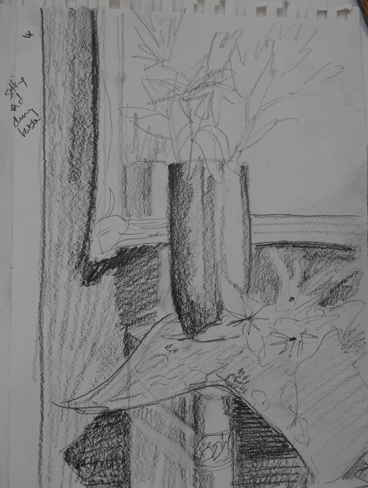
With this in mind, I went back to the
drawing board (literally!) and changed some of the objects – I added another
swatch of the same fabric, added a small earthenware jug and some peaches. This was to achieve more interest and
relationships between the objects. I
also found some more upholstery fabric that is a dark red patterned satin which
I stuck to the mirror to get a patterned background.
I moved these objects around to achieve an
interesting composition and changed my viewpoint a number of times until I
found one I was happy with. I drew this
in charcoal pencil, removing the highlights with an eraser.

I am much happier with this – both
compositionally and tonally (light source / direction is the large window to
the right).
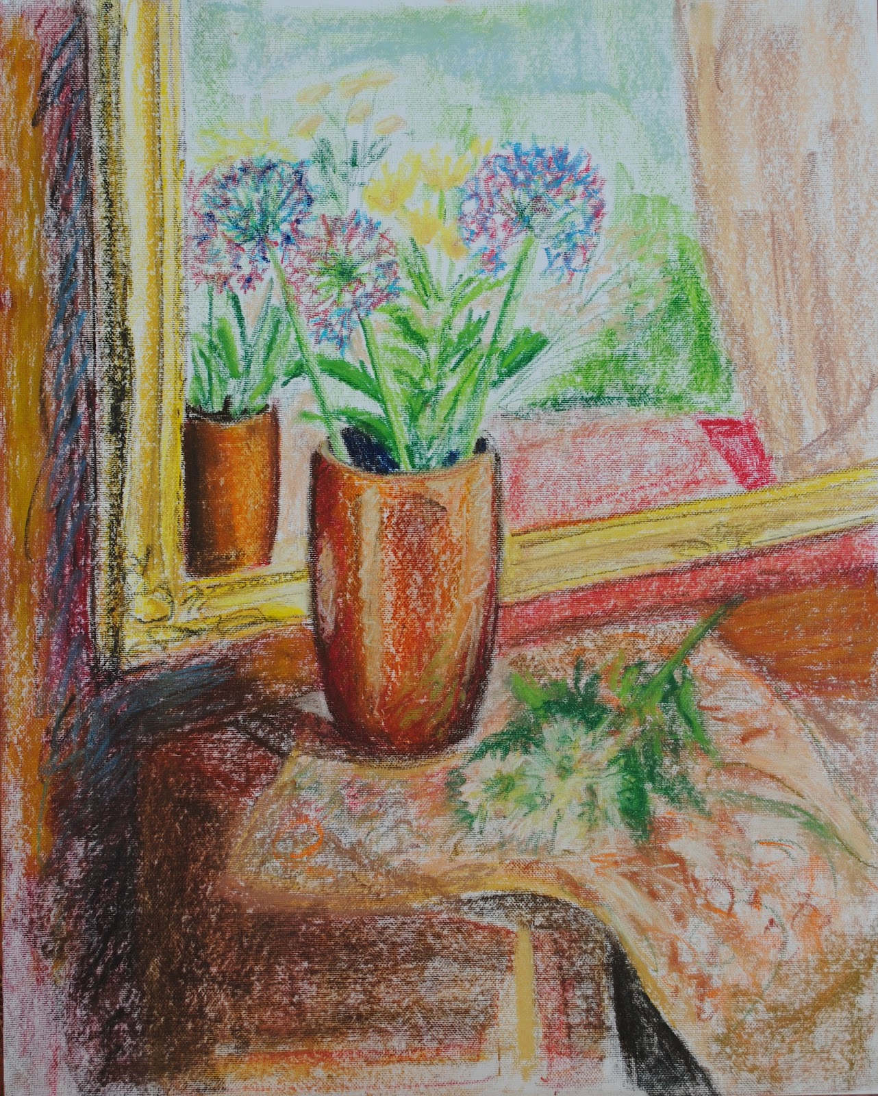
Inspired by Vuillard, I made the painting
almost square with the main object (the vase) off-centre. Overall the composition is broadly triangular
down from the flowers, with a steeper angle on the right side. The edge of the fabric on the left helps to
lead the eye up through the laid-down stem and up towards the vase.
Generally the composition is mid-toned with
contrasting areas of dark shadow under and around the piano, the sides and behind
the vase and the top of the jug, effectively “framing” the objects.
Strong areas of contrast are the highlights
on the vase, top of the jug and the positioning of light flowers against the
dark background.
The dark red fabric (covering the mirror)
is satin so multi-tonal with an interesting repetitive pattern. The darker tones and colours of the vase are
almost identical to the background so the edge of the vase can be “lost” on the
left-hand side, merging into the background.
The addition of the jug gives interesting
negative space (the spout and stopper are an unusual shape, along with the jug
handle) and the curved shape contrasts well with the more upright vase. Placing the jug next to the vase reflects the
colour of the vase onto the top side of the jug.
The peaches are almost the same colour and
virtually the same tone as the highlights on the vase, as well as repeating the
roundness of the jug. They also reflect
off the vase
Adding another layer of fabric gives an
additional direction (line curving towards the vase), plus the two swatches are
slightly different tones (although the same fabric!). Using a “straight-on” view (seated from
across the room) gives an interesting bottom line and negative space under the
piano allowing for darker areas, plus the shadow behind the fabric against the
highlighted area gives a good contrast.
The blue and cream flowers add a cooler hue
to the warmth of the rest of the painting (as seen in Anemones), although in
this drawing (because I used cheap paper!) I could not erase enough to get the
correct light tones of the flowers. I
may add a few creamy yellow roses from the garden to get more of a “blowsy”
feel to the flowers (possibly also Lady’s Mantle which is a frothy lime green).
Colour
My next step was to trial different colour
mixes – as there is a lot of colour in this painting, I didn’t want to use too
many “ready mixed” colours and aimed to use a fairly limited colour palette to
achieve a harmonious balance.
My first test mix would be a grey. Vuillard frequently used a light neutral gray
base in order to achieve his colour relationships so I mixed ultramarine with
burnt umber – this gives a very rich dark brown/grey, almost black, which I
also felt would be a good dark to use for shadows, etc. I lightened this with white to find a neutral
gray.
The red shades came next – the background
is a rich red, with the vase having red tones along with the wood of the piano
and on the fabrics. I found it difficult
to mix shades of red when doing my still life of peppers – you can’t add black
or white as the red goes brown and pink respectively. I decided on two shades of red, crimson
alizarin and cadmium red – the crimson is a blue-red and the cadmium an
orange-red so I felt both of these could be mixed to cover the spectrum of hues
I wished to use. There is a very dark
red on the background so I mixed this with some of the ultramarine/umber mix
which gave a good dark burgundy without dulling the red too much. I then tested various mixes of both reds with
yellow, and then adding white to achieve more peachy hues.
I need blues and greens for the flowers so
I mixed the ultramarine with a variety of white and reds to get a range of
paler blues and lilacs. An interesting
colour mixed here was ultramarine & white, then blended with a mix of
crimson/cad red and yellow which gave a matt terracotta brown which I felt
would be a useful colour to mix with others for the wood of the piano.
For the greens I mixed both the purple with
yellow, and then the ultramarine with yellow and both with white to achieve a
range of greens for the foliage – I may need to add a hint of red to some of
the greens to tone down when completing the painting.
The remaining colours I need are neutrals
for the glazed jug – even though this is, in fact, a fairly flat pale cream, I
wanted a range which could be blended/ stippled to give more colour variation
so I tested the burnt umber on its own then lightened with white (plus a hint
of the terracotta previously mixed to add more warmth). If I use cream flowers, I can also add a hint
of yellow or peach to this putty colour for the variations in hue.

So, I will be using just six colours in
this painting:
Ultramarine
Burnt Umber
Crimson Alizarin
Cadmium Red
Cadmium Yellow
White
The other thing I did when testing these
colour mixes was to paint using dry paint, without the addition of turps or
linseed oil. This was because Vuillard
used dry paint to achieve a matt texture.
By using the paint thickly, you have to work with the brush more to push
the paint into the surface of the paper/canvas.
This gives the advantage that you can’t be
too precious with line as the dry brush does not give a smooth, solid outline. It also has the advantage of breaking the
paint up, leaving a more textured surface and sometimes allowing the under-layer
to show through.
The disadvantages will be that: (1) it is
time-consuming as the paint does not flow as easily; (2) you use a lot more
paint; and (3) it will take quite a long time to dry.
My next step will be to test some of the
colour mixes together – particularly the background, vase, peaches and
fabric.
For the background, I am testing the reds
over a neutral grey ground and also the white of the paper. In my first tutor report, he said that the
exercise in opaque over transparent was “much
more expressive” and “The subject is
somehow rendered more effectively this way round probably because you ‘found’
the trees rather than painting them directly. It is important to learn from
this.” So, I think it is important
to test some areas of the painting to discover whether “finding” the pattern by
using negative space in this way will be more successful than the painting the
pattern itself.
Experiments
Here, I have set out how I plan to choose
the best colour/ application methods – ideas in plain text, results in italic.
Fabric
Background
For the fabric, I will experiment with
painting the dark burgundy on first, and then picking out the lighter areas so
the main pattern is, in effect, painted in reverse. Hopefully this will have the effect of making
the background more textured and varied.
I will also experiment with painting this with the mid-tone and lightest
red first, and then adding the dark tones and highlights to see which works
best.

I
painted three test patches of colour over a grey ground and, when, they were
dry, applied the other colours over the top.
The darkest red didn’t work very well – the colour was much too dark for
the medium and lighter red to show up at all so discounted that one.
The
mid-red background was too dull and flat – because I had painted the mid-tone,
I then overpainted both the darkest and lightest reds. This made the main colour area (the mid-tone)
very flat and also the lightest red highlights didn’t show up against the
darkest, and if I had left the darkest red to dry first, the lightest red would
have been too sharp.
The
lightest red test patch gave the best results.
First I added the darkest red with a flat brush for the oval background
and then (using a small flat brush on its edge) painted in the chevron pattern,
followed by the flower and leaf pattern (again with the edge of the brush)
leaving the lightest red paint for the patterns. I then painted in the mid-red paint, using
loose brush strokes which gave a layered effect and more texture. I painted this loosely and allowed areas to
blend with the darkest paint to soften the overall pattern.
As the background is fabric with a satin
finish, rather than wallpaper, I will also need to experiment with the effect
of light shining onto it as I don’t want it to overpower the overall
painting. As with Vuillard’s Anemones,
it may be a case of painting the background much looser, and slightly blurred,
to give the effect of depth.
As
above, I loosely brushed over some of the paint to soften the edges and blur
the detail. I also added flecks of
yellow and the darkest red paint into the mid-red to give more depth and a
slightly shiny finish.
As the pattern is repetitive, I will also
try creating a stamp (something like a potato print or sponge print) or stencil
to see how this works. Another idea I
had is fabric wrapped around a form (wire?) for the curved ovals.
Tried
this with a potato but would need a really large one to make the pattern big
enough! Also quite difficult to cut a
clean edge so will have to think about this further.
The other area I need to test with regard
to the background is painting this last, which is counter-intuitive but, again,
could result in a more expressive painting by picking out the flowers, etc (if
you zoom Van Gogh’s sunflower paintings, you can see that he added his
backgrounds after painting the flowers).
I had
a mid-grey board prepared and so loosely painted in a flower and then painted
round this with a mix of the light and mid-red.
This gives much more of a textured, multi-tonal effect than painting
straight onto a ground. I think this is
because you have to move the brush around so much more to go round the shapes,
and this multi-directional approach works well.
When painting around something, you also leave small gaps for the ground
to show through which adds a further colour to the painting. It is also easier to get a very delicate,
thin line than when painting the object directly which should be useful when
painting the stems and delicate flowers I want to use.
Vase
This is very multi-toned naturally so I
need to test the colours as I think this will need to be layered to get the
right effect – hopefully the dry paint I plan to use will help here so that the
underlayers show through. I also need to
play with my brushes and directional brush strokes to see how these work to get
the burnished effect. It may also be
necessary to paint the vase/some areas of the vase white first to achieve more
colour luminance (needed here to get the bronzed effect).


I
applied a number of colours loosely using a dry bristle brush – mid red,
yellow, dark-red and burnt umber. For
the darkest areas I applied a neat ultramarine.
Then, using a fan brush, I applied quick strokes over the vase area with
white, yellow, red, orange, and then yellow again. For the highlights, I painted white, then
yellow, then white again with the fan brush on its side to get a broken line
which I then brushed down with the flat of the brush. Finally, when this was dry, I applied a
dilute, transparent yellow wash over half the vase to see how this would affect
the overall colours.
I was
pleased with how this turned out but there need to be a few modifications for
the final piece – the burnt umber and ultramarine need to be applied first with
the other colours over the top. I found
the ultramarine was blending with the yellow to give a green tinge which I did
not want. I also need a smaller fan
brush to apply small areas of highlight.
The yellow glaze does work – although not a very noticeable colour
change, it does brighten the overall tone of the vase and gives a further layer
of colour depth, which is the effect I want to achieve.
Peaches
Because peaches are naturally fuzzy, they
do not reflect light but seem to absorb it, so need to try out the colours to
be used which range from quite a bright yellow through pinky-orange to a dark
burgundy, which can appear almost purple.
Where the light hits the peach, the resulting highlight is slightly
grey/ blue in tone so I will need to do an oil sketch to get this right – would
it be better to allow the grey ground to show through, or paint grey
highlights/wash over the top.

I
completed two test sketches for these – one on a grey ground and one on the
white of the paper (the colours in this photo are actually darker than in reality). The first drawing had colour applied and then stippled with the top of a round brush, and the yellow highlight applied with a small flat brush and dry paint. The second used the same colours applied more expressively with a small flat brush, which I think gives a better overall effect (would apply the highlight in the same way as the top sketch).
Jug
For the jug, the brown is a very dark, cool
brown so I think the mix of ultramarine/ burnt umber should be a good
match. I will try applying these using a
broken colour technique which, hopefully, will mix optically to give more depth. I also need to view the white jug in
Vuillard’s Flowers in a Vase more closely to see how he has achieved the glossy
effect without actually using the colour of the jug (sadly cannot zoom this on
Bridgeman). This jug actually has two
distinct textures – the brown top is matt and the bottom cream is glazed so
much more reflective and the highlights / creating the form will need to be
much crisper on the bottom and looser on the top.

For
the top of the jug, I first used a dry ultramarine with a bristle brush to
scrub the paint into the surface. I then
applied burnt umber loosely over most of the area and then used ultramarine
again for the very darkest areas.
Finally, I mixed a very pale blue-white and used this as the highlight
colour (rubbed in with fingers) to show the semi-reflective surface. I think the mix of the blue and brown works
well here to give a very cool brown.
For
the base, I used a pink (crimson & white) and peach (orange & white) to
add some colour to the pale cream. I
think overpainted with a two tones of cream (umber & crimson & white)
and used ultramarine and umber to create the form of the base and shadows and
the finished the highlights with the same blue-white as used on the top.
I am
pleased with the colours here but not the brushwork, so for the final painting,
I will apply the pink, peaches and blue, leave these to dry and then add the
cream layers on top with the highlights in thicker paint once dry.
Once this had (almost! see streaking) dried, I applied a very transparent yellow glaze, which gave more of an earthenware colour which I like and think would work well in the final painting.
Fabric
The fabric on the piano top is an
upholstery fabric so quite textured, almost like a rug, the overall patterning
is quite square (created by the weaving process). When researching still life, Willem Kalf’s
“Still Life with Drinking Horn” showed a textured rug so I will look at this
closely to see how he achieved this finish, and also look at more expressive
ways of depicting patterned fabric (eg impressionist).
Willem
Kalf’s fabric is beautifully done – darkest tone first, then mid-toned squares
of colour to achieve the woven effect, followed by dull white (light grey?)
highlighted dots to achieve the depth.
This would be very time consuming and probably too crisp in comparison
with the looser brushwork in the rest of the painting. I then re-looked at Vuillard’s fabric and
decided to go with loose, swirling brushstrokes for the pattern. For the base colour of the fabric, I applied
a peachy-orange and then used the darker tone of cream (used in the jug above)
over the top to get depth of colour. For
the pattern, I will used the darker greens from the foliage and the reds from
the background painting in swirling lines using a small round brush and then
blurred out slightly (using either fingers or brush).
Flowers
& foliage
Need to experiments to see whether paint
mixed with white to achieve colour luminance or whether to paint flowers out in
white and then apply layers of transparent paint to glaze.


