For this
exercise, I painted my local shopping centre.
Someone in their wisdom in the 60s decided it would be a good idea to
pull down a well-established row of shops and replace it with a pedestrianesed
concrete shopping centre. The centre
really is a concrete monstrosity with raised walkways, metal railings and drab
paving, built over the service area, from which large ventilation ducts rise
like funnels on a steamship. This link
does not appear to have been lost on the authorities, who have decided that
painting all the concrete bright blue will make it appear more jaunty and
cheerful. The centre has been very run
down now for over 20 years and successive councils/companies have promised
regeneration work which has never happened. Consequently, many of the shops are
boarded up or have metal shutters down, and those that remain are charity
shops, “bargain” shops, etc. To try to
cheer up the centre, local church and youth groups have begun painting
traditional shop fronts over the hoardings in at attempt to instil local pride
and stop some of the graffiti.
As I know
the site very well, I only did two sketches (really didn’t feel comfortable
doing so here) as well as reference photos, especially of the graffiti and
paint colour. The first sketch was of
two of the painted “shops” in fineliner pen and coloured pencil.

My second
sketch was a portrait orientation looking diagonally down the centre. It had been raining the day before and so, as
per usual, there were very large puddles between the funnels as the water
doesn’t drain away. I quickly sketched
in the few figures that were there and coloured in with marker pen at
home.

I felt this
sketch included too much bare concrete foreground so decided to widen out the
sketch to include the shops further to the left (which are all empty with metal
shutters covering the fronts). While
considering the placement of the scene on the paper, I realised that the
figures in my sketch (made landscape) would be approximately at the end of the
spiral of the golden section (had recently researched this) and so decided to
try the proportions of the golden section and drew this first on a sheet of
A4. This really helped concentrate my
focus in the initial drawing – I set the figures at the point where the spiral
ends and then worked back from there. I
was conscious of the “funnels” dominating the painting, both in terms of scale
and colour and so was concerned not to have the larger funnel dead central in
the painting.

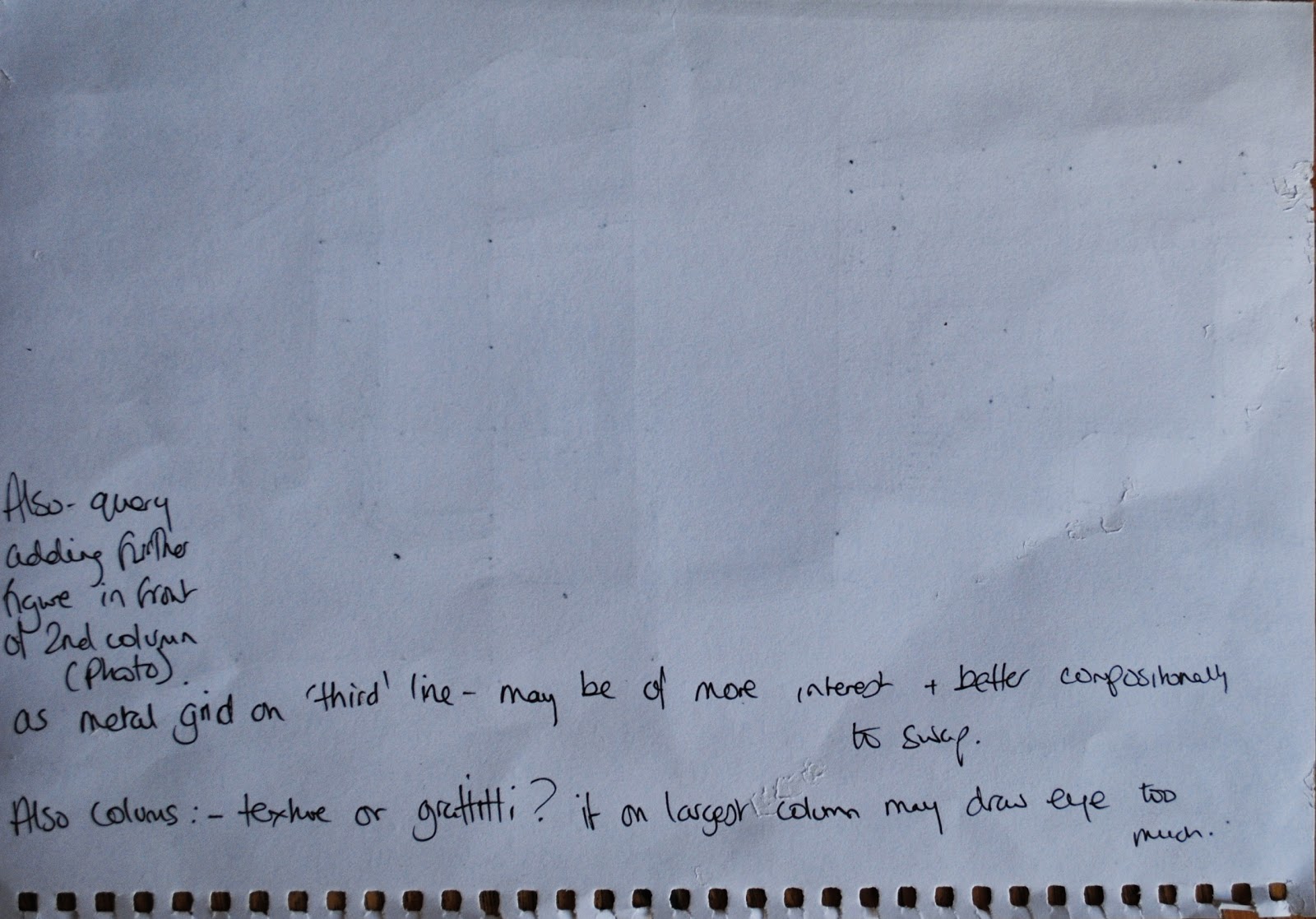
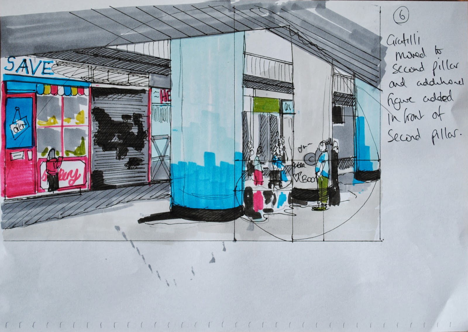
As I was
happy with this basic layout, I then completed five further studies – testing
different colours, figure placement and graffiti markings (notes on each sheet),
as well as a tonal study based on the final drawing.


As all these
drawings were all small (less than A4), I decided to create a life-size study
by gridding up the original (sticking together five sheets of A3!), again using
marker pens for speed, so I could make sure the composition still worked on a
larger scale, and also to give me a size reference for any studies.
I created a
range of blues in oil for the pillars which, although colour matched to be
photos, appeared too bright against a white ground so applied over black acrylic
which dulled the colour sufficiently. I also tested areas of texture – the dark
boards are peeling and flaking which, again, adds to the feeling of neglect –
using masking tape and dragging a paint handle through the wet paint. For the boards, the masking tape option
worked better but will have to be sufficiently thin to achieve the desired
effect.


In terms of
a support, I decided to use the back of a large mountboard. Because of the size of this painting, paper
would have been too thin and canvas would have given too rough a surface for
the effects I wanted to achieve. To
test this surface, I applied gesso roughly using a large brush to add a basic,
linear texture to the board and then applied test patches over this (impasto
paint, impasto medium, collage (ripped newspaper overpainted) and sanding back
paint to give a weathered look.

To begin the
finished piece, I applied gesso to the board, followed by a very dilute ground
of raw umber to kill the white. After
transferring the image, I blocked in the darkest areas with a “black” created
from red/blue/payne’s grey.

Once dry,
very thin strips of masking tape were cut with a knife and carefully applied to
the ceiling area to achieve the perspective lines, followed by a layer of
impasto medium, textured with the back of a palette knife. Once dry, a thicker layer of the dark tone
was applied, along with the blue reflections from the pillars to blend the
edges while still wet. Once semi-dry,
the masking tape was removed which had the benefit of also removing some
further areas of paint, adding to the peeling texture.

Progress of
the piece below (completed in six sessions)


Assessment of finished painting

I wanted to
paint this scene for two reasons; (1) reflecting the contemporary reality of
our urban areas and (2) to recognise the efforts of local communities to help
themselves. Local shopping centres are
supposed to bring the community together to work, shop and socialise but many
are so run down that all they attract are people who want to damage the area. While there is very little that individuals
can do to improve areas such as this (which is very much in the hands of local
authorities and developers) at least some people are trying to make a
difference, even if only in a small way.
From an
artistic perspective, many landscapes still focus on the beautiful (whether
rural landscapes or townscapes comprising attractive architecture) while many
communities’ reality of their surroundings is very different. I found this, even now, to be the case while
researching this painting; very few contemporary artists actually paint
run-down areas. This is quite surprising
when you consider the wealth of artistic possibilities to be found in subjects
such as peeling paint, broken architecture and graffiti.
In terms of
my ideas of how to express my feelings about this location, I wanted to show
the hard, angular “concreteness” of the centre which I felt could be achieved
using the linear qualities of all the straight lines and hard angles. By only including a few people in the
painting (which is actually not unusual for the centre – no-one goes there
unless they have to) I think I have achieved a sense of alienation that people often
feel when surrounded by a concrete jungle.
The colour,
although fairly realistic, works to contrast areas of the painting. Most of the background areas are painted in
monotone greys, black and white to convey the dullness of the scene, contrasted
with the “fake” bright blue paint on the columns and the very bright, crisp red
of the bakery. I am not sure whether a
viewer would immediately recognise that the bakery is actually a mural, but I
think the ambiguity would make then think twice about this. Also, the scale of the bakery is very
different to the surrounding shops/figures, and much more crisply painted.
I think the
composition works to lead the eye around the painting – the bright red of the
bakery draws your gaze first, then stark, dark diagonals of the roof area,
followed by the figures, reflected figures and the graffiti.
The
techniques I planned to use worked well – the impasto medium for the underside
of the roof, the slight texture caused by the thick application of gesso and
sanding back (door of the bakery).
Originally, I planned to apply more layers of blue paint to the columns,
but after the first application over the original dark tone, decided that the
roughness and streaky nature of this first layer worked well in itself to show
the layered, rough surface of the painted concrete.
The only
think I was (and still am) unsure about was including the lettering in the
painting. Writing always draws your eye
immediately, but I felt the use of the words “save” (which actually was a shop
called Mega-Save) and “open” would give an express feeling about the painting.
No comments:
Post a Comment