As this is such an expansive
topic, I decided to create a basic timeline for art movements / schools /
prominent artists, and then concentrate on artists whose work I find
particularly admirable. In this
research, where possible, I have sought out British artists as I believe there
was, and is, such a wealth of talent in the UK in landscape painting.
Movements / Schools / Prominent Artists
Rococo (early 18th
Century) – Rococo was a term used generally in decorative arts, but also
applied to painting styles. In landscape painting, this style often refers to
pastoral landscapes, including classical architecture, country houses or
aristocrats pursuing leisure pursuits.
Main artists linked to this movement include Jean-Antoine Watteau,
Francois Boucher and Jean-Honore Fragonard.
The English Watercolourists spanned the period between the Rococo and
continued well into the Romantic period. Watercolour cakes, or pans, were created in
1784, which allowed artists the freedom to take this medium out into the
landscape. The speed of drying,
versatility and delicacy of watercolours made them ideal for accurate,
topographical paintings of real scenes.
Other artists (such as John Sell Cotman and Thomas Girtin) worked in a
more expressive way, using broad washes of colour, emphasising mood, space and
light in the landscape.
Romanticism (including Picturesque
and Sublime) – the term Romanticism encompasses more than just
painting – it was a movement that covered the arts, music and literature, and
lasted (roughly) between 1750 and 1850.
Previously landscapes were frequently pastoral scenes, tamed by man, to
be used for leisure or to set off imagined architecture. Romanticism rebelled against this,
emphasising strong emotions expressed visually - paintings of wild seas,
storms, Gothic architecture and mountains - and promoted the “picturesque” in
landscapes.
Caspar David Friedrich, the
German Romantic, and Joseph Mallord William Turner are probably the artists who
most embody this period in landscape history.
Friedrich
Friedrich’s
is best known for his landscapes, often featuring gothic architecture, mists,
winter scenes or lone figures in wild landscapes. His work is frequently symbolic, containing
religious and allegorical references, embodying his emotional connection towards
his native landscape.
Friedrich’s “Winter Landscape
with a Church” is in the National Gallery so I have viewed this painting, and
what strikes you is how small it is for the detail it contains, just 32 x
45cm. It is a very atmospheric painting;
the first thing you notice because of the tonal contrast is the fir trees in
the foreground, followed by the church seen through the pale pink light (of
morning or dusk), its shape mirroring that of the fir trees. It is only when you look more closely you see
the sticks in the foreground, which in fact are crutches, leading you to the
very small figure leaning against the rock.
In turn, that figure is gazing at a crucifix set in the fir trees, its
tone so similar to the tree you only pick out the detail from the covering of
snow on the protruding surfaces of the carving.
It is a very ambiguous painting – is the crippled man praying at the
crucifix because he has made it to the church?; or has he given up, lying in
the snow because he can’t make the church?
Is he about to die in the snow as night falls or has he made it through
the night, and is praying at the safe arrival of the dawn?
Again, a very atmospheric
painting but this time the feeling is of the grandeur of the landscape
contrasted with the solitude of the sole figure in the landscape. By portraying him from behind, Friedrich
invites us to become the figure, not to look at him, but to gaze past him,
imaging ourselves standing on the top of the rocky outcrop with the mist
swirling below us.
J M W Turner (1775-1851)
Turner produced so many works,
most of them bequeathed to the nation of his death, that reams of works have
been written about his drawings, sketches, engravings, watercolours and oils
(in excess of 40,000 individual pieces).
Turner began painting landscape
watercolours at a very early age and, although clearly an excellent draftsman
from his topographical watercolours, Turner moved from the Picturesque style to
what was known as “the Sublime”, and it is these later works that are so
admired.
So what was the Sublime? The Tate Gallery (which houses the Turner
Bequest) suggests:
“The word, of Latin origin,
means something that is ‘set or raised aloft, high up’. The sublime is further
defined as having the quality of such greatness, magnitude or intensity,
whether physical, metaphysical, moral, aesthetic or spiritual, that our ability
to perceive or comprehend it is temporarily overwhelmed. The best-known theory published in Britain is
Edmund Burke’s A Philosophical Enquiry into the Origin of Our Ideas of the
Sublime and Beautiful (1757). Burke’s definition of the sublime focuses on such
terms as darkness, obscurity, privation, vastness, magnificence, loudness and suddenness,
and that our reaction is defined by a kind of pleasurable terror. During the eighteenth and nineteenth
centuries, the sublime was associated in particular with the immensity or
turbulence of Nature and human responses to it. Consequently, in Western art,
‘sublime’ landscapes and seascapes, especially those from the Romantic period,
often represent towering mountain ranges, deep chasms, violent storms and seas,
volcanic eruptions or avalanches which, if actually experienced, would be life
threatening[1].
Turner’s articulation of the
Sublime was expressed with his vivid use of colour and expansive use of
paint. Turner painted vivid watercolours
in sketchbooks throughout his life, travelling widely on the continent, to
France, Germany, Switzerland and Italy.
More unusually, his style of watercolour painting was transferred to his
oil paintings. While many artists create
loose, watercolour sketches as initial studies/ aide memoires, then working
them up in a studio in a more detailed, polished manner, Turner kept the use of
luminous colour, applied transparently in layers, with thick impasto used to
create his glowing highlights and sunsets.
The above painting was created
from Turner’s on-the-spot sketches of the event, followed by a series of
watercolours, then the oil painting (Turner created two oils of the event)
which was submitted (in an unfinished state) to the British Institution
exhibition in 1835.
“On the so-called Varnishing
Day (when artists were allowed to touch up their works before the exhibition
opened), he worked continuously for hours to complete it, never once pausing to
contemplate what he had done or intended to do, while astounded colleagues
watched his performance. He used such unconventional techniques as applying
paint with a palette knife meant for mixing pigments. When
finished, he sidled off without a second glance at the canvas, causing one
colleague to comment: “That’s masterly...he knows it is done, and he is off.”
“Turner could be quite guarded
about his painting methods and, except on Varnishing Days, rarely allowed
others to watch him work. In 1818, however, he allowed a young companion to sit
by his side while he created a watercolor study of a large warship. An account
of the session was recorded later by a relative: “He began by pouring wet paint onto the
paper till it was saturated, he tore, he scratched, he scrubbed at it in a kind
of frenzy and the whole thing was chaos — but gradually and as if by magic the
lovely ship, with all its exquisite minutia, came into being and by luncheon
time the drawing was taken down in triumph.” (Edith Mary Fawkes, typescript in
National Gallery, London)” [2]
While at the National Gallery, I took the opportunity to have another
look at The Fighting Temeraire, Tugged to her Last Berth to be Broken Up(1838).
My notes state:
- Use of repeated colour – tug / sea / sky
- Very sheer layers of paint bottom left in sea and also sky
- Very thick impasto above setting sun, applied almost perspectively, strokes becoming more vertical as rotating from sun.
- Temeraire paint applied in sheer layers – ghostly, bleached out timbers (almost skeletonised) contrasted by thicker, more substantial paint & darker, richer colours of tug.
- Buoy gives strong diagonal focus – moves the eye across the painting from the ships.
- Bouy same colour as upperdeck of tug, tone reflected in water, also same tone for strongest sunset colour and in smoke/steam of tug.
- Buildings on land seen through haze simply applied with few vertical strokes to define warehouses/wharfs.
Although Constable was a direct
contemporary of Turner, his work could not be more different “The Romantic aspects of John Constable’s
work are more subtle. In his canvases,
nature becomes an extension of his feelings, echoing William Wordsworth’s
definition of poetry as “emotion recollected in tranquillity”.”[3]
Constable was an East Anglian
native, born in Suffolk, and painted this area of Suffolk and North Essex (to
this day known as Constable Country) throughout his whole life, never
travelling abroad. Under no stretch of
the imagination can East Anglia be described as dramatic – the countryside is
very flat and rural, no wild seas, high mountains or waterfalls. So his paintings portrayed what he knew - rural working
life, far from the dramatic scenery of other Romatic era painters.
Constable frequently created
large oil sketches, often almost full size.
I viewed a sketch in the National Gallery “Salisbury Cathedral and Leadenhall from the River Avon, 1820” which, although not one of the very large
sketches (52 x 77cm) provides a good indication of his working methods. My notes while viewing:
- Painted on mid-toned brown ground, sky very loose blue and white over the brown
- Vigorous brushstrokes on the trees (very similar to Cezanne –reviewed below – directional brushmarks.
- Figures just small strokes of colour (black / white / red) to stand out against green background.
- Cathedral most exact; strong contrast on the spires with light/shadow; white highlights brushed over loosely to give effect of light on stonework/masonry.
His sketches are much looser
than his finished work, in which every part of the canvas is covered, in
expressive brushmarks, quite thick impasto in areas and a large number of tiny
white highlights. Even though Constable
is now much loved for his depiction of the East Anglian countryside, his work
doesn’t particularly appeal to me – it appears very sentimental to modern eyes
and their rustic charm appears somewhat forced.
However, there is no denying
Constable’s influence on the world of landscape art, including the realist
painters of the Barbizon School (see below) and his portrayal of the English
landscape:
“No painter every represented the English countryside with greater
fidelity, the sparkle of dew on grass, the glint of sunshine on sappy leaves,
the noble forms of great elms, the enthralling intricacies of the hedgerow, and
a result his paintings are very much more than straightforward topographical
records. He sought to recapture them in
a childhood vision of the harmony of nature in all its innocent purity and to
re-examine it in the light of mature reflection – to use it as a touchstone
against which all experience of nature and art and his sense of being part of
creation, might be tested.”[4]
Realism
Realism in the mid 19th
century came to be centred on France, and especially what came to be known in
landscape painting as “The Barbizon School”. The Barbizon artists were influenced by
English artists, such as Constable (who exhibited in Paris in 1824), but also
the realist paintings of Gustav Courbet and Francois Millet:
“Although they appear anything but revolutionary today, the paintings
of Courbet provoked a storm of protest at the Salon … largely because they
contravened normal academic practice.
Scenes of rural life were expected to be small and picturesque,
providing town-dwellers with a sense of escapism. The peasant pictures of Courbet and Millet,
however, were large, on a scale that was normally reserved for major historical
themes or religious subjects. Worse
still, they focused on the hardship of modern working conditions, a topic that
smacked dangerously of socialist politics to conservative critics.”[5]
Barbizon was a small village in
the Forest of Fontainebleau
near Paris, a favourite destination for those seeking leisure away from the
bustle of Paris. The newly opened inn, Auberge
Ganne, encouraged painters to lodge there, creating a small community of
artists. The most famous of the
Barbizon school artists were Jean-Baptiste
Camille Corot, Théodore Rousseau, Jean-François Millet, and
Charles-François Daubigny.
Rousseau based his style on earlier,
17th century Dutch landscapes and, unusually for that period,
completed many of his paintings outdoors, spending more time in the forests
than any of the other artists. In "TheEdge of the Forest at Fontainebleau, Setting Sun, 1850-51 (oil on canvas)", Rousseau uses a framing
technique of the arch of the tree canopy to draw the viewer towards the scene
of the cattle wading in the stream. He
returns to this view again in “The Forest at Fontainebleau: Morning” where he
captures the effect of morning light through the trees beautifully.
“Barbizon
was more than just a place; it was an encompassing motif. Like other great
motifs, it transcended geography. Inspirational and nurturing, even despite
daily trials of frostbitten fingers at winter's dawn or sunburned hands at
summer's midday, Barbizon answered the quest for landscape's metaphoric power.
The artists of the Barbizon School showed us the rapidly disappearing rural
path to painterly "truth" well before the Impressionists trod the same
forest and fields, carrying with them their factory-made satchels with metallic
tubes of new pigments and their modern ways of seeing. Landscape painting was
no longer subservient to history painting. It was history in the making.”[6]
The Barbizon school directly
influenced many young French artists, who later became known as Impressionists
– Monet, Renoir, Sisley and Bazille all visited Fontainebleau Forest, and
although they became famous for their “plein air” paintings it was ,in fact,
the Barbizons who introduced them to this type of painting.
Pre-Raphelite Brotherhood
Back in Britain, the
Pre-Raphelites were contemporaries of the Realist school in France, and
although Pre-Raphelite paintings conjure images of medieval, Arthurian and literary
imagery, their landscapes were closely observed, with every detail described in
paint.
The Brotherhood expressed four declarations for
their art:
- To have genuine ideas to express
- To study nature attentively, so as to know how to express them
- To sympathise with what is direct and serious and heartfelt in previous art, to the exclusion of what is conventional and self-parodying and learned by rote
- Most indispensable of all, to produce thoroughly good pictures and statues
The writer and most respected critic
of the day, John Ruskin, was a supporter of the Pre-Raphelites encouraging artists
to “go to Nature in all singleness of
heart, and walk with her laboriously and trustingly, having no other thoughts
but how best to penetrate her meaning, and remember her instructions; rejecting
nothing, selecting nothing, and scorning nothing; believing all things to be
right and good, and rejoicing always in the truth.”[7]
Probably the finest Pre-Raphelite
landscape is William Holman Hunt’s Our English Coasts, 1852 ('Strayed Sheep')
(viewed in the Tate Britain).
The painting’s location was a
beauty spot on the cliffs overlooking Covehurst Bay, Hastings. Originally the title of this work was “Our
English Coasts”, with “The Lost Sheep” also engraved on the frame. However, when the painting was exhibited in
France, it was entitled “Strayed Sheep”, alluding to its religious message. This
painting is very closely observed; the detail and textures achieved are stunning. The treatment of the light in this painting
is very cleverly used – highlighting the beach, the flowers running down the
side of the cliff and casting an almost holy glow over the sheep. The undulations of the shadows on the field
create the tree line for us and leading the viewer around the painting. The sheep are also arranged in a broad “S”
curve to guide us down towards the last sheep, tangled in the brambles, waiting
for us to rescue him.
Impressionists – all the impressionist painters experimented with
painting “plein air” at some point, although Monet is probably the artist who
most embraced this style of painting.
The combination of the exploration of the portrayal of light, painting
outside in nature in the Barbizon tradition, newly manufactured bright paint
colours in tubes and the influence of Japanese prints (with their lack of
modelling and perspective) all worked to create what we now think of as typical
Impressionist paintings. Their use of
colour as tone altered the way landscapes were painted – much brighter colours
were introduced; instead of the earthier browns, ochres and greys, blues and
purple were often used for shadows. Many
(though not all) avoided using very dark tones, especially black, which
lightened and brightened the overall tones of landscapes considerably.
In the above image, the trunks
of the trees are painted using shades of blue, with a hint of pink, and the darker
tone to signify the riverbank is dark blue, rather than a darker tone of green.
Probably the most famous
investigation into the use of colour in the landscape was Monet's haystack
series. Here, he painted grainstacks at
all different times of day, and in different weather conditions, to study the
light effects and colour combinations.
In "Haystacks, midday,1890 (oil on canvas)" Monet uses very bright sunlight and the shadow that
creates. Overall, the shadows looks a
dark blue-grey, but on closer inspection, is created by hues of red, green,
blues and purple.
The Post Impressionists moved landscapes another step from accurate,
topographical representation towards abstraction with the expressive works of
Cezanne and Van Gogh. Cezanne
repeatedly painted Mont Sainte-Victoire, a rugged mountain near his home in Aix
on Provence. His earlier works are
representational, although still clearly Cezanne’s work with his typical short,
diagonal brushstrokes. Looking through
the series of paintings, you can see the increasing freedom with which he
paints the mountain, using broader brushstrokes and large patches of colour to
denote the form of the landscape.
"Montagne Sainte-Victoire,c.1887 (oil on canvas)"
"Montagne Sainte-Victoire,1904-06 (oil on canvas)"
Van Gogh was strongly
influenced by both the broken brushwork of the impressionists and the solid
colour and outlined forms of Japanese woodcut prints. Blending the two together created his
distinctive style that was such an influence on the modern art world. As well as studying closely from nature (as
evidenced by his many monochrome ink and pencil drawings), Van Gogh used his
imagination in terms of colour and its emotional impact upon both him and the
landscape. Repeated forms were also
evident in his work – Cypress trees, wheatfields and sowers in the field
(influence of Millet) were common themes.
"Red Vineyards at Arles,1888 (oil on canvas)" and "Cypresses, 1889 (oil on canvas)"
A more symbolic approach was
taken to landscape by The Nabis – a group of French artists who developed a
more subjective and simplified approach to painting (inspired variously by
Symbolism, Gaugin (and his experiments with Cloissonism) and decorative Japanese
prints). Paul Serusier moved his
landscape art towards abstraction (see The Talisman below) as well as
simplifying the forms (Undergrowth) into paintings that are heavily influenced
by Japanese prints.
The Talisman (from

Moving into the 20th century, art as a whole become much less representational, moving towards more expressive styles of painting. As our next research is on expressive landscapes, I will review landscape progression in movements and artists (such as Fauvism, the German Expressionists, Gustav Klimt, Surrealism, War Artists) at this stage and concentrate on more representational styles here.
Early 20th Century
Early 20th Century
British painting was heavily influenced by the Impressionists, and the more
abstract influences seen on the Continent at that time did not really reach the
country until around the First World War.
The Camden Town Group (Walter
Sickert, Harold Gilman, Spencer Gore, Charles Ginners and others) formed in
1911 and focused on their contemporary, urban surroundings of London –
including domestic scenes and portraiture, as well as the urban landscape. Sickert was probably the most important
painter in the group, having studied in France and being influenced by
Degas. In terms of landscape, both
Spencer Gore and Harold Gilman used the impressionistic device of broken
brushwork and a colourful palette, later using simplified forms and flatter
colours.
However, in contrast to the
Impressionists’ rural scenes in bright sunshine, the Camden Town Group
“observed modernity in many aspects of the world, in the bustling streets and
lonely lodging houses of the capital, but also in the marginal spaces at the
edges of the city, in other urban centres … and in places where human
intervention had shaped and altered the landscape”[1]
The rise of suburbia, and new
ideas about urban planning and social environment, also attracted some of the
group to the garden city of Letchworth, carefully planned to promote healthy
living and the dream of a better society.
Spencer Gore’s “The Cinder
Path”, painted in Letchworth in 1912, was an expression of his view that
modernity “was best expressed through naturalistic observation, and in
Letchworth, where rural countryside met urban planning, he found a landscape
that was both natural and man-made, a synthesis of the traditional and
contemporary.[2]”
The garden suburbs were also
depicted by William Ratcliffe. His
painting “Hampstead Garden Suburb from Willifield Way” of a community founded
on the same ideals at Letchworth, recreates the view from the Suburb’s social
club, designed to bring together a socially mixed population. The painting itself has a vibrant palette of
greens, terracotta, pinks and lilacs; the structures simplified in blocks of
colour to create a coherent but restful image, with the long lilac shadows
(contrasted against the yellow roads) to place the time as late afternoon /
early evening.
A further simplification of the
landscape was created by Robert Bevan in his painting Maples at Cuckfield. Using a palette comprising blues, lilacs,
greens and pinks with orange for contrast he uses broad brushstrokes of colour
to simplify the pastoral scene, imposing his own colour palette onto the scene.
In contrast, Charles Ginner’s
work was often much darker, and his training as an architect led him to tackle
many complex urban views. He painted in
very deliberate, short impasto strokes, giving his work an almost tapestry
effect. He also treated all parts of the
canvas with equal attention, which can be unsettling as there is no area of
focus or differentiation. The impasto
strokes, to me, have the same effect as pointillist paintings, which makes the
scene appear very flat and unreal, although Ginner was meticulous in recording
his views, so they are topographically accurate.
Researching
Charles Ginner’s northern scenes immediately brought to mind the works of one
of Britains’ most distinctive landscape painters – L S Lowry, best known for
his industrial landscapes of Manchester and Salford.
Lowry worked
as a rent collector (continuing even after he became a famous artist), and so
spent his life on the streets, observing the everyday life of the communities
around the industrial sites:
"I saw the industrial scene and I was
affected by it. I tried to paint it all the time. I tried to paint the
industrial scene as best I could. It wasn't easy. Well, a camera could have
done the scene straight off.[1]"
Lowry’s
paintings are so instantly recognisable because of the consistency of his work
– he always painted on a very pale canvas (applying layers of flake white which
he allowed to age and turn slightly creamy before starting to paint) and he
always used the same colour palette:
“I am a simple man, and I use simple
materials: ivory, black, vermilion (red), Prussian blue, yellow ochre, flake
white and no medium (e.g. linseed oil). That's all I've ever used in my
paintings. I like oils... I like a medium you can work into over a period of
time".
Lowry
painted his works in a room in his home, using pencil sketches which he drew on
whatever paper he had to hand. A large
number of his sketches can be viewed at http://www.thelowry.com/gallery/work-by-ls-lowry-places.
The two things
which strike me about Lowry’s townscapes are the lack of modelling of form (the
weather seems to be constantly grey and dull, resulting in very little tonal
difference in the buildings, no extremes of highlight and shadow, and the lack
of shadows from any of the figures); as well as his enigmatic “matchstick
men”. Although uncited, the following
quote on Wikepedia would explain Lowry’s intention with regard to the people in
his paintings:
"I wanted to paint myself into what absorbed
me [...] Natural figures would have broken the spell of it, so I made my
figures half unreal. Some critics have said that I turned my figures into
puppets, as if my aim were to hint at the hard economic nescessities that drove
them. To say the truth, I was not thinking very much about the people. I did
not care for them in the way a social reformer does. They are part of a private
beauty that haunted me. I loved them and the houses in the same way: as part of
a vision”.
While
researching Lowry, I found that Tate Britain is holding an exhibition of Lowry
next month “Lowry and the Painting of Modern Life” - http://www.tate.org.uk/whats-on/tate-britain/exhibition/lowry-and-painting-modern-life
which I must go to as it is the first retrospective to be held in London since
his death. As a major British painter on
the 20th century, there is a definite lack of his work in the south
of the country.
In its
promotional material, the Tate links Lowry’s work to his teacher and the work
of other French artists at the turn of the century:
“Lowry and the Painting of Modern Life
demonstrates Lowry’s connections and debts to French painting of the later 19th
century and its determination to make art out of the realities of the emerging
modern city. It reveals what Lowry learned from the strange symbolist
townscapes of his French born teacher Adolphe Valette and demonstrate important
parallels with the painters of modern life Vincent van Gogh, Camille Pissarro,
Georges Seurat and Maurice Utrillo, drawing upon these artists’s continuous
search for ways to depict the unlovely facts of the city’s edges and the
landscape made by industrialisation.”
A number of
American painters also resisted the artist trend towards abstraction,
preferring their own style of depicting modern, American life – the realism of
the Ash Can School was followed by the more atmospheric portrayal of America’s
east coast by, arguably, America’s most well known painter, Edward Hopper.
Hopper
painted both landscapes and interiors, often containing either solitary
figures, or figures not interacting with other, producing melancholic scenes
commenting on the loneliness of modern, urban life.
As fellow
painter Charles Burchfield wrote for the catalogue of the Museum of Modern
Art's 1933 Hopper retrospective: "Hopper's
viewpoint is essentially classic; he presents his subjects without sentiment,
propaganda, or theatrics. He is the pure painter, interested in his material
for its own sake, and in the exploitation of his idea of form, color, and space
division[2]."
Much of the
landscape art of the 20th century I will be researching under
“expressive landscapes” and so am jumping forward to look at contemporary
landscape art.
David Hockney is probably
Britain’s most famous current landscape artist, especially following his recent
exhibition at the Royal Academy, “A Bigger Picture” (which I visited twice - previously reviewed). While there was debate about the quality and
repetitive nature of some of this work (http://www.guardian.co.uk/artanddesign/2012/jan/22/david-hockney-bigger-picture-review),
I think this exhibition capture the public’s imagination about our own
traditional, rural landscape to an extent that the debate by art critics was
most irrelevant to most exhibition-goers.
An artist following in the
great tradition of English watercolourists is David Prentice (a replicated article from the Artist in 2011 is
replicated on the Number Nine The Gallery website : http://www.numberninethegallery.com/artists/davidprentice_article_201106.pdf)
where he explains his working practices of either sketching from nature
figuratively in watercolour or using expansive photographs, before expanding
into more abstract forms on larger canvases in oil. See http://www.moseley-art-school.co.uk/photo_009A.jpg
for his painting Earnslaw Elevation. Prentice
also creates semi-abstract evocative pastel drawings with atmospheric colours,
a number of which can be viewed on the above gallery’s website.
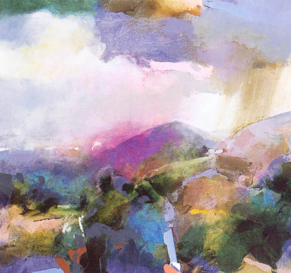
A modern, local artist whose
work I particularly admire is Hashim Akib – an artist I first came across at
the “Art on the Railings” event in Southend.
Akib works solely in acrylics, using large, vigorous brush strokes
combined with very vibrant, strong acrylic colour to create his works. A large number of his works are market scenes
from Brick Lane, but he also creates landscape and street scenes (see two links
below). Akib’s works are representative,
but very loose and fresh using pure, undiluted colour frequently applied by
having more than one colour on the brush before painting.
http://www.hashimakib.com/photo_7626477.html
(Tree sketch)
http://www.hashimakib.com/images/the_strand_web.jpg
(The Strand)
[1] http://www.thelowry.com/ls-lowry/his-life-and-work,
viewed 22 May 2013
[2]
http://www.edwardhopper.net/the-lighthouse-at-two-lights.jsp,
viewed 22 May 2013
[1]‘Art
of the Sublime’, http://www.tate.org.uk/whats-on/tate-britain/display/art-and-sublime accessed 23
March 2013.
[2] www.nga.gov/exhibitions/2007/turner/turner_brochure.pdf
- National Gallery of Art, Washington, accessed 23 March 2013
[3]
Dixon, AG (2008) Art, Dorling Kindersley, 2008,
p297.
[4]
Honour, Hugh & Fleming, John “A World History
of Art”, Laurence King Publishing, 2008, p653.
[5]
Dixon, AG “Art”, Dorling Kindersley, 2008, p324.
[6]
Amory, Dita. "The Barbizon School: French
Painters of Nature". In Heilbrunn Timeline of Art History. New York: The
Metropolitan Museum of Art, 2000–. http://www.metmuseum.org/toah/hd/bfpn/hd_bfpn.htm
(March 2007), viewed 23 March 2013
[7]
Fowle, Francis “William Holman Hunt Our English
Coasts “ Tate Britain 2000- http://www.tate.org.uk/art/artworks/hunt-our-english-coasts-1852-strayed-sheep-n05665/text-summary viewed 23 March 2013
No comments:
Post a Comment