This exercise asks us to find an arrangement of objects in our home that “happen to be there” and are not too complex in appearance.
I started this exercise by drawing (in biro – one of my preferred quick sketch media) the table next to my sofa – this is a square table with space underneath to hold a wicker basket. On top of the table is a dark blue ceramic lamp base with a neutral cream fabric shade, in the opposite corner sits two ceramic birds which I initially moved next to the lamp to make a more interesting composition.
The first sketch I did included underneath the table as well as the objects on it – see sketch and attached notes pages.

The second sketch was more linear, using more contour-type lines to define the objects and rescale the bird ornaments. I then decided that I didn’t like the birds as I felt the composition was too confusing and lacked any definite focus.

So I removed those and added a small plate with three apples sitting on it which I felt worked better, allowing the lamp to be the “centre of attention” while providing a second area of interest and colour contrast (green against the blue).
I also decided to draw in a much more graphic style – using the contours to show the 3d form of the object, and also to see through the object. This is also interesting because although it makes it easier to draw by making things transparent, it also provides ambiguity in the drawing because it is not easy to work out which part of the object is to the front (think this is especially true of the lampshade).

My next step was to have a play with Brushes on my ipad – I find this quite helpful in drawing basic shapes and assisting with colour choices (and also because you can copy over and change/improve things without destroying your original image), as well as being much quicker than redrawing. The images are shown below:

The first image was just a basic 2d colour study of the basic objects which I outlined in black to highlight the linear forms and line relationships. The second expanded this by adding a lighter tone to the table, and a contrasting blue texture to the background. I also added some gridlines here – a pale blue for the lampshade and faint red lines on the apples and lamp base. The third sketch lightened the colour of the table more – I still felt it was too dark and the objects would be better displayed with a more neutral background – as well as adding highlights and texture to the ceramic lamp, and adding the lighter tones to demonstrate the light coming from the lamp.
I did a quick colour study in acrylics, using the red gridlines on the lampshade, base and apples. Although this did show the form in a more linear way, I felt the lines were much too thick and dominant in the painting (especially under the pale lampshade) and that the yellow lampshade was too bright. I also decided that there was too much empty foreground so decided to bring the whole composition forward and so making the lamp much bigger. I also felt that the dark blue texturing in the wall was too strong.
At this point I was also thinking about how to paint the patterned, drip-glaze area on the vase so did a small test study – I used pva dripped straight from the container in a grid pattern, then painted ultramarine paint over the top. Once this was dry I made a very dilute mix of green which I daubed on and then tilted to allow it to drip. My final test was to flick pale paint on top of this to add the speckled effect. I had mixed feelings about this experiment: the pva from the container is quite difficult to control and so blobbed and went quite thick in some areas; and the transparent green paint doesn’t really show up against the blue and, because of the pva, didn’t really drip down well. I think using pva to add the “grid lines” may be too dominating for the composition I have chosen here, but could work well in other ways – more thinking and experimenting required!

When I sat down to sketch out the composition in paint (using watered down raw umber acrylic and a fine brush), I also changed the viewpoint slightly (as well as bringing the whole composition down the page) – I sat on the floor so I was more or less at a level with the table and slightly looking up at the lampshade. Since sketching my original drawings, I had placed some flowers in a glass vase on the table and so decided to partially include this – one flower in particular (a pale Gerberera) was leaning gracefully from the vase towards the lamp and plate which I felt added a more circular composition – leading the eye back in towards the centre. The glass vase is also rectangular in shape and so added a contrasting vertical to all the curved lines and horizontals. I don’t really want to include all the flowers in the vase though (would probably detract from the main focus) so may crop this edge slightly when finished.


At this stage, I also did a compositional analysis of the main lines (see photo of sketchbook page below). Aside from the main triangle created by the whole of the lamp and plate of fruit, many of the main lines are gentle downward curving lines, with these being mirrored by the upward curve of the bottom of the lamp base and lines of the bowl.
The next stage was a loose underpainting in acrylic (mainly for speed) in ultramarine and white for the background and lamp and raw umber for the table. As I said previously, I felt the blue over the creamy yellow walls was too strong, so I decided to underpaint the blue this time, to allow me to vary the thickness of the paint going over the blue.
Using my new found colour mixing skills(!) I created the background walls with a mix of lemon yellow, yellow ochre and white, and then knocked back the yellowness slightly by adding just a hint of violet to the mix which produced a very warm neutral dark cream. I was originally going to apply the paint with a large flat brush at different angles but, as this is a large canvas (A2) decided to use a small palette knife. I started applying the paint in downward strokes – as I did so, I started thinking that I could apply the paint using directional strokes on my objects as well to create “lines” in the paint rather than physically painting lines of colour or pva.
I lightened the original wall mix slightly for the area above and underneath the lampshade to show the light shining through, and then darkened the colour with the addition of a little more violet to darken the tone for the shadow (undecided as to whether this is too pink or not – will review when the other colours added to painting).
The same mix for the lampshade shade was then varied slightly (white added for the paler areas and inner surface, and more violet added to the darker area at the bottom) to paint the shade itself (actually looks more pink in the photo than it does in reality).
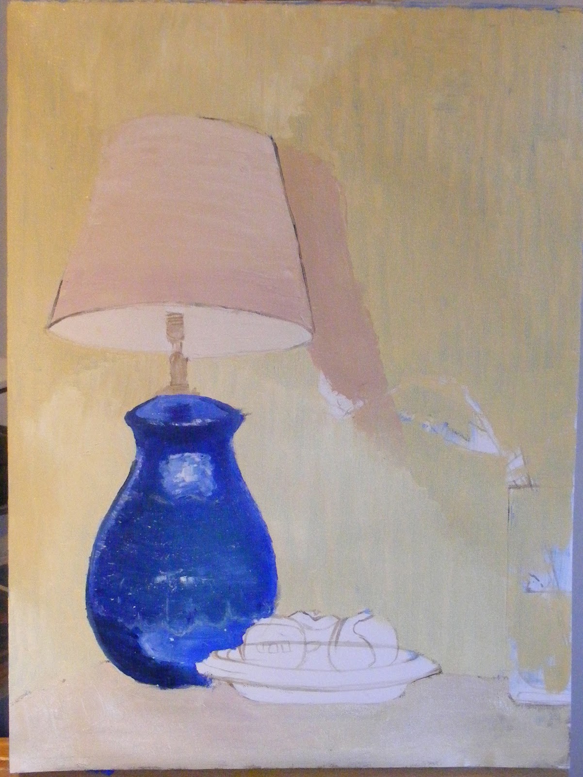
The lamp base was mainly Ultramarine with added Violet and Prussian Blue (plus a very small amount of black) for the darkest areas. Again the paint was applied directionally with a knife around the circumference of the base. For the glazed area I added a blue-green mix I had left over from making my colour wheel and then gently flicked some dilute white paint into the area with an old, rough, bristle brush. I then gently dragged the palette knife over the surface of the paint to blend slightly (close up photo below). I added the white highlights and reflected plate with neat white paint. Reviewing this, I decided that I had the line of the top of curve of the base wrong (from this viewpoint it should be straight and possibly slightly convex) so will redo this area when the paint has dried slightly!

My final area to complete in this session was the table top. Again, I used a slightly variation of the colour used for the walls/lampshade over the brown wash, and applied quickly using directional marks with the palette knife.
My next session concentrated on the apples – I had a sagey-green left over from the colour mixing exercises (always mix up too much paint!) so used this as the base colour, again applied with a knife. Although, in reality, the apples were a much brighter green, I wanted the blue of the lamp base to remain to main focus of colour in the painting so I deliberately left them a more muted shade.
I also completed the bowl – using a brush for neatness next to the apples but applying the remainder of the white and dark grey with a knife, followed by a thin line of dilute ultramarine for the decoration.
The vase was completed with a few simple strokes of shades of grey over the cream wall and then the flowers were added. I didn’t want to complicate the composition with too many flowers so I just painted in the gerberara in a violet lightened with a little yellow and white (similar mix to the lampshade but with more violet), the crysanths in white using a knife and cocktail stick for the numerous petals and then the remaining flower (don’t know what it is!) is a similar violet shade.
At this point I had to let the paint dry a little before I could add my final outlines in black – I found it very difficult to get a smooth line here! I deliberately didn’t outline everything, such as the flowers as I felt this would be too much and would destroy the delicate outlines.

When this painting is dry enough, I plan to crop the right edge so have demonstrated this by cropping the photo below.

Review of this piece of work
I think the colours work well in this painting – using quite a limited palette has created, overall, a harmonious painting. Although violet is the complement to yellow, neither shade is saturated enough for it to be obvious. The blue stands out well against the creamy-yellow and the green of the apples is reflected in the blue lamp base. The only colour I am still not sure about is the shadow on the wall behind the lamp – it may have been better to darken slightly with a brown rather than a violet here, as I think the colour is a little too pink.
The composition is strong and quite basic – I decided not to add the shadows on the table nor the flex of the lamp in the end as I didn’t want to detract from the main objects or lose the linear effects.
I was also very pleased with completing 95% of the painting with a painting knife – I haven’t really had much experience with these in the past and it is good to get some experience with a fairly simple composition so you learn the best ways of handling both the knife and the paint. Although I found some of the smaller areas tricky to do, it did make me think about simplifying and just concentrating on overall shapes and tones.
After I had finished this painting, I decided I could take this composition / idea a stage further. After deciding not to use my composition/grid lines idea on the main painting, I thought I would create an abstract drawing based on the main colours and shapes.
I did this quickly (about an hour) in acrylic on an A3 canvas sheet. Using my original composition for the shapes of forms, I created a background of mixed yellows and ultramarine, loosely painting shapes and then overpainting them to give an impression of the forms. I then flicked white paint onto this while damp to represent the texture I had created in my oil painting. The final stage was to add contour lines, hinting at what was there. I think this was particularly effective for the “half” of a lampshade that I painted and the circular form of the “floating” apple shape. I think the only things I would change on this would be: the black on the yellow is a little harsh – possibly a lighter grey or another colour would have worked better; and I would have made the main blue area more circular and slightly more central as I think it takes the eye out of the composition.


